


Lynn Z
Work
Resume
Etc.
About


Client
Duration
Team
New York Transit Museum
September 2022 — December 2022
Zhenglin Zhang
Michelle Huang
Medhaswi Paturu
My Role
UX Designer & Researcher
, I collaborated with 2 grad students majoring in IXD (Information Experience Design) at Pratt Institute. I proactively participated in the entire user research process, led 2 user interviews, and led interface design.Research:
User Interview, Competitive Analysis, Affinity Diagram, Card Sorting, Tree testing, Information Architecture, Usability Testing, and Research AnalysisDesign:
Ideation sketching, Wireframing, Prototyping, Interaction & Visual DesignProject Overview
Context
Problem
Solution
New York Transit Museum (NYTM) is dedicated to telling and preserving the stories of mass transportation. NYTM is looking to redesign its website to better enhance the visitors' experience and achieve business goals.
Insights were leveraged to improve the navigation and organization of the existing website thus making the site more intuitive. We constructed a new information architecture and hi-fi prototypes for the homepage, ticketing and membership page.
unclear hierarchies
unfixed design principles
lacking responsiveness
when visiting NYTM


Process
DISCOVER
DESIGN
DELIVER
KICK-OFF


How might we improve the ticketing and membership experience to increase business conversion?
Initial Problem Statement from NYTM
Jennifer from NYTM
User Research
users' goals and frustrations are identified


Pain Points
based on NYTM's current site
Derived A Solution From The Research
Insight #1: Need to create a New Information Architecture
We need to understand users' mental models, refer to IA on the competitor's website, and enhance user experience and information hierarchy efficiency.
Competitive Analysis
how are similar sites organized?
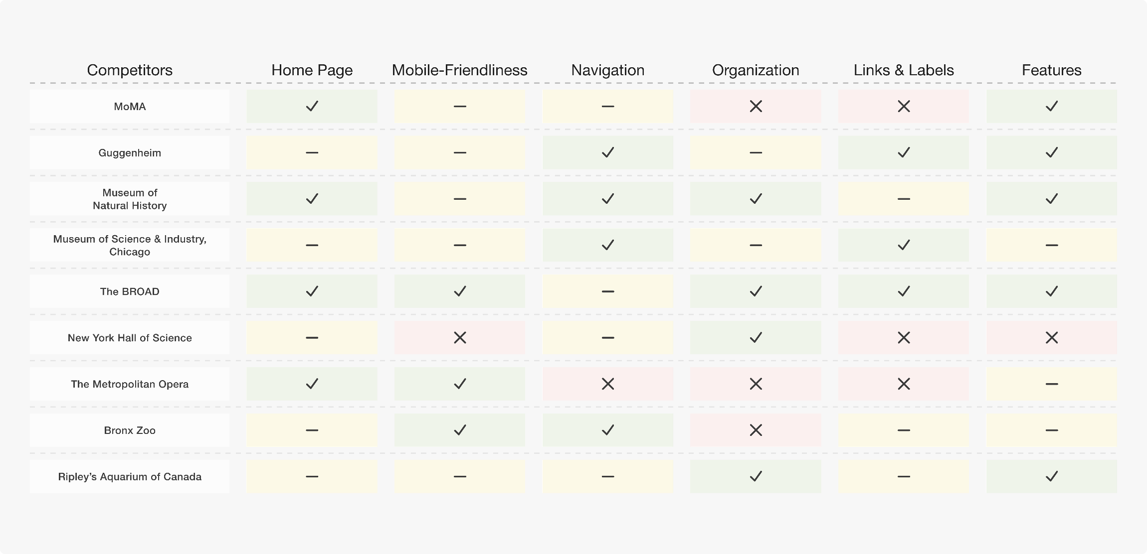
Competitive Analysis
competitive analysis of nine sites
was conducted to streamline and reorganize the site's content thereby providing users with a clearer understanding of its navigation and structure.CTAs of Ticketing & Membership are emphasized at the same level
Group Tours and Accessibility are grouped under the visit section
Family visits are part of the education section


Card Sorting & Tree Testing
clear labeling makes it easier to sort and find information
conducted a card sorting with 29 cards to
learn more about the users' mental models. Then, atree test
was conducted to evaluate whether our navigation structure was easy to understand.Subdivide the Visit according to individual and group visits.
All education-related content is gathered under the Learn with Us section and categorized according to target visitors.
In the content strategy, priority is decided based on what users search and care about most often.
Streamlined Sitemap


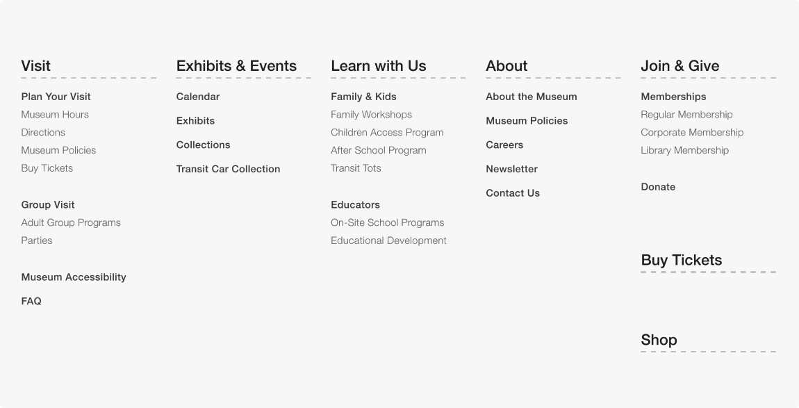
Based On The Streamlined Information Architecture
Insight #2: Need to optimize ticketing and membership pages
Developing Preliminary Designs
Low-To-Medium Fidelity Prototype
keeping the design responsive
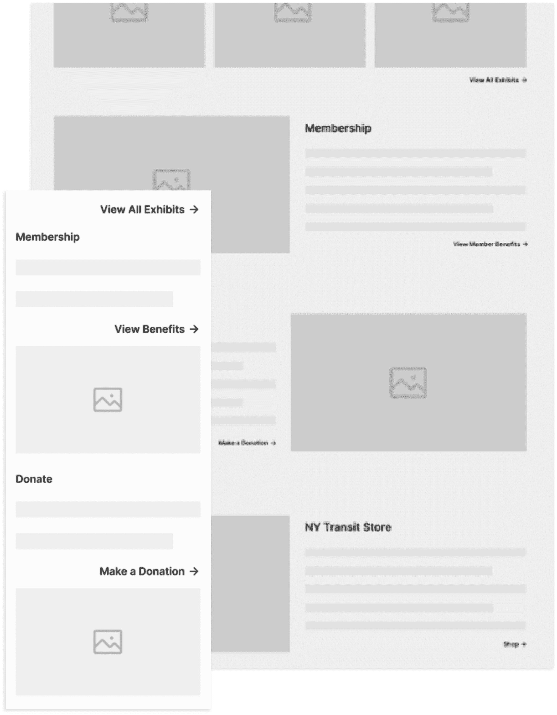
interactive low-to-medium fidelity prototypes
on Figma.responsive
.
Prototype Test
a more vivid and authentic experience is pursued
Contrast
,Hierarchy
,Repetition
,White Space
, andUnity
.By The Evolving…
What are the features of the iteratively redesigned pages?
Constructing High-Fidelity Prototypes
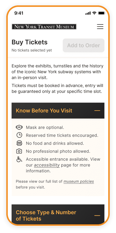
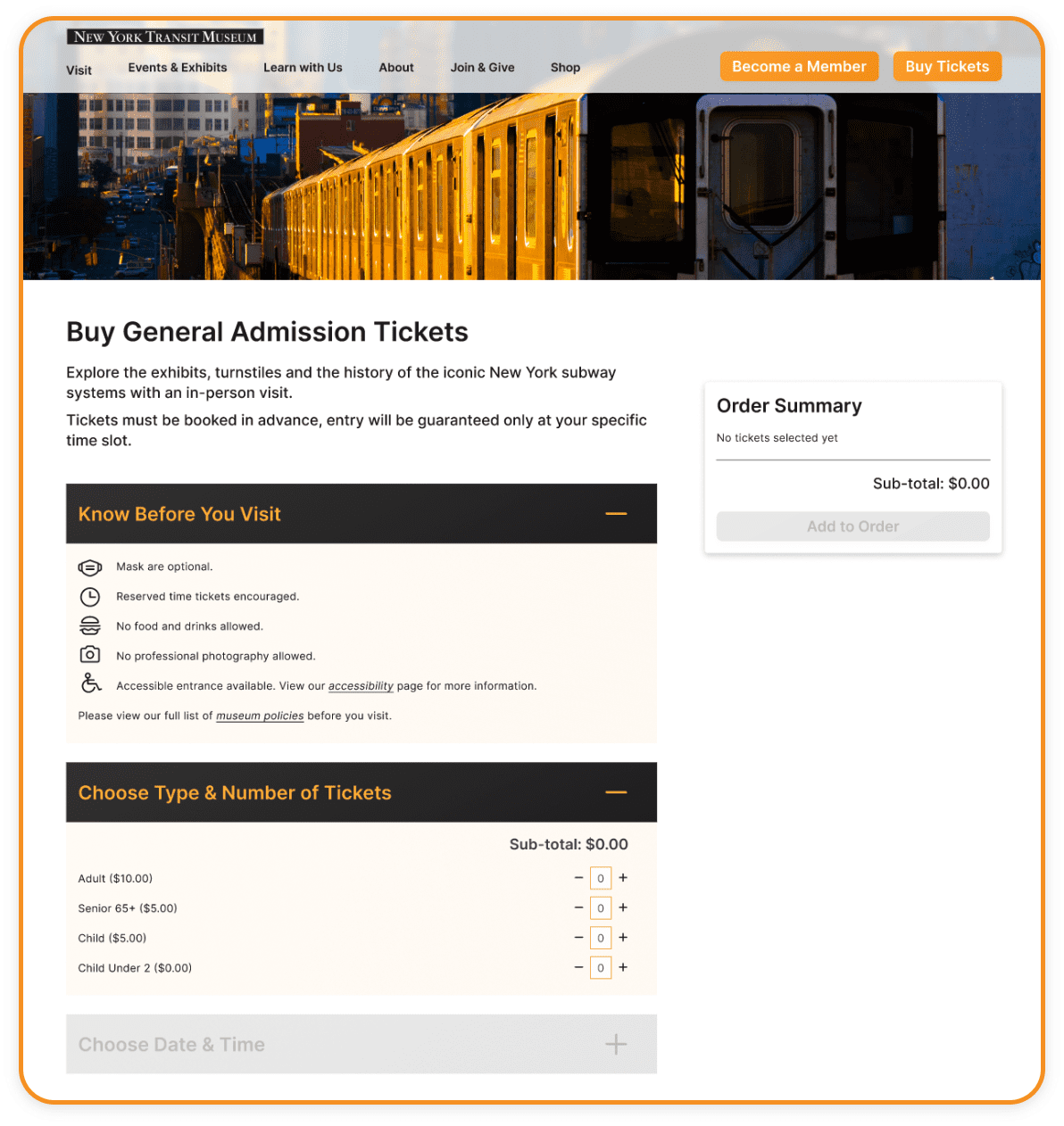
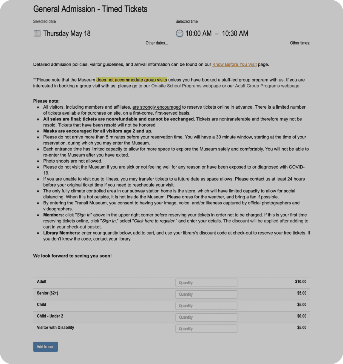

Feature 1 - Interactive Visual Cues
hints and guidance to make the information clearer
The date and time section and the “Add to Order” button are both unclickable until the essential information, such as the number and type of tickets, is confirmed and entered. This user-centered approach ensures that essential details are not overlooked and provides guidance on a lengthy page.
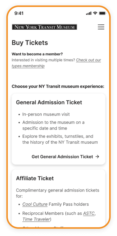

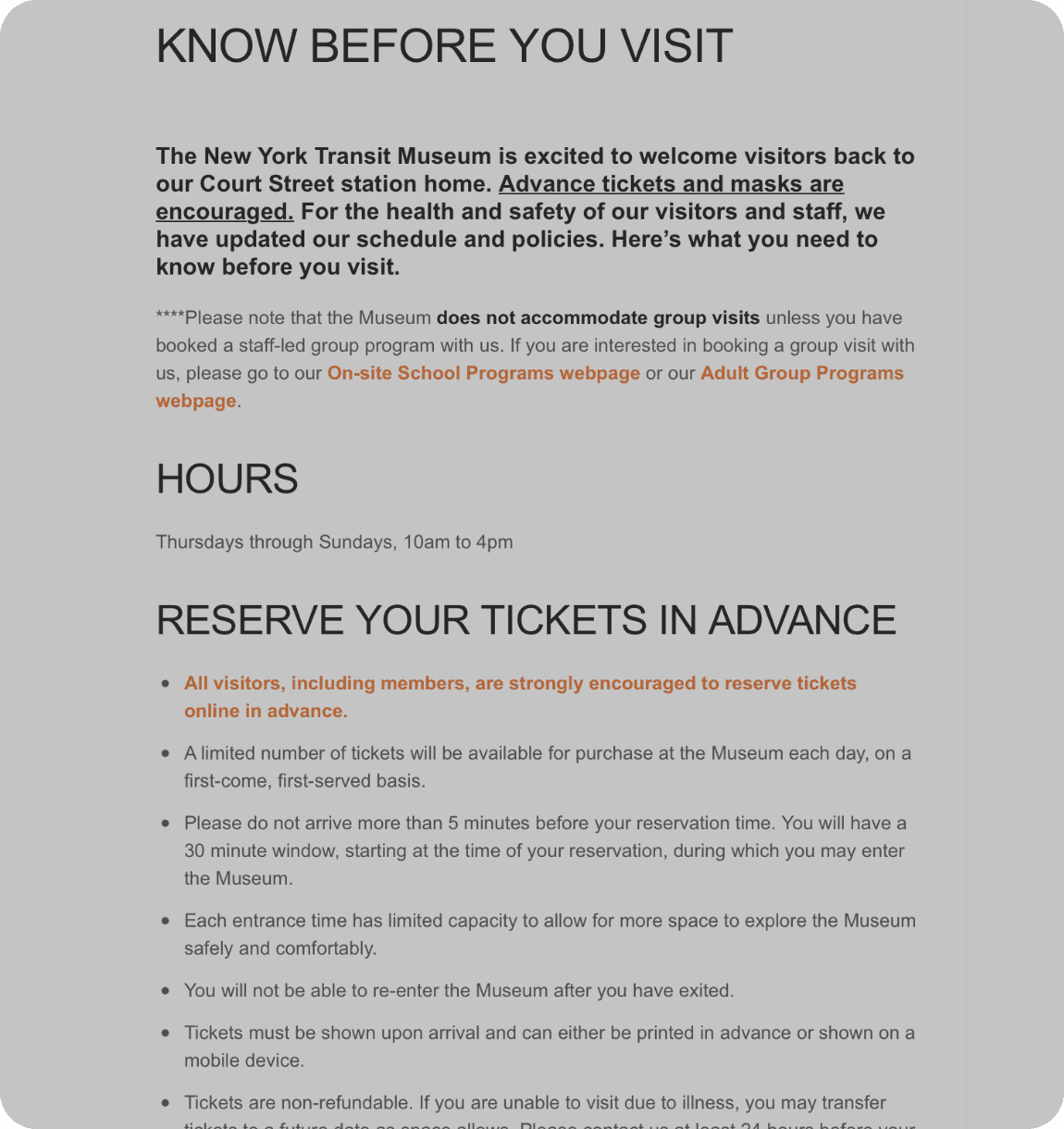

Feature 2 - Collapsible Panel
increase interactivity and streamline page content
To facilitate user comparison and avoid confusion during the ticketing process, we reorganized the content strategy into four categories based on museum ticket types. The category information is presented upfront, enabling users to make informed decisions and preventing the need to re-enter the ticketing process.
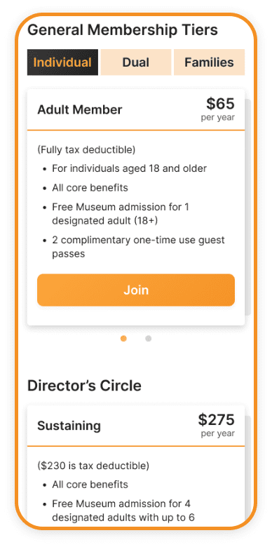
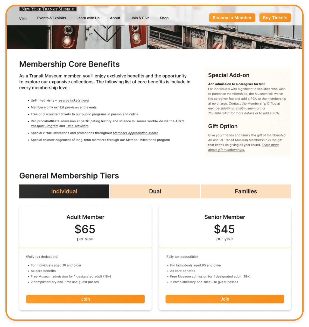
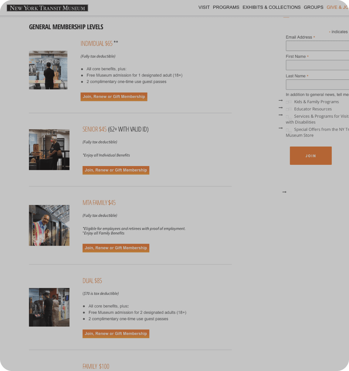

Feature 3 - Rational Organization
keep users informed overall
To enhance
user experience in comparing prices and benefits of different membership tiers, we arranged similar
types of memberships side by side.
For mobile optimization, we implemented card stacking to
streamline the page length and introduce interactive elements.

Outcomes
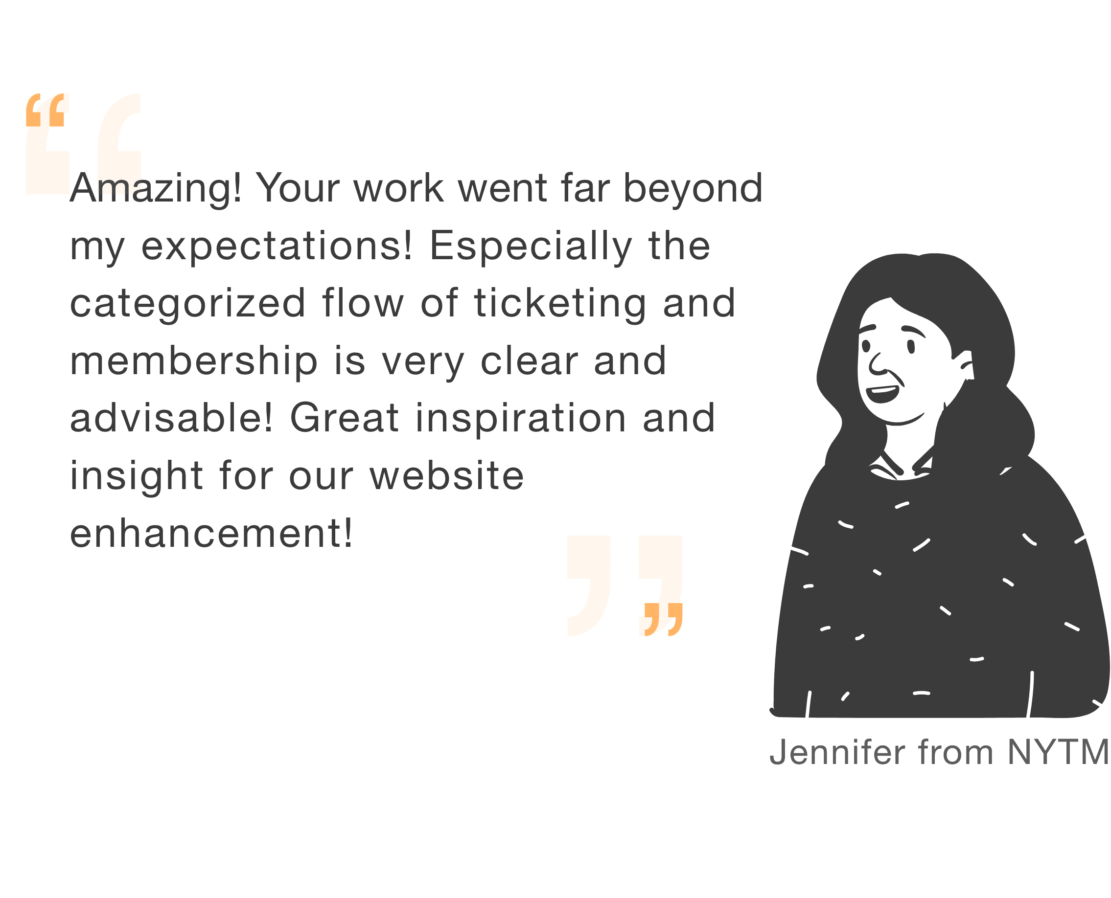
the client was impressed
future iterations
my takeaways
The NYTM website's navigation and organization system has been redesigned after three months of research, focusing specifically on the ticketing and membership page. This model has not been widely tested with users. In order to achieve an inclusive design, further tests and research should be conducted in the future.
This project provided me with a more systematic learning of a series of methodologies for user research and familiarized me with the logic and procedures from user demand to deliverable design.