


Lynn Z
Work
Resume
Etc.
About


Client
Duration
Team
Medscape
Mar 2023 — Apr 2023
Zhenglin Zhang Esther Kim Ellen Mahoney Scott Dunay Todd Wu
My Role
UX Designer & Researcher
, I collaborated with 4 grad students majoring in IXD (Information Experience Design) and LIS (Library Information Science) at Pratt Institute. I proactively participated in the entire user research process, led 2 user interviews, and led interface design.Research:
User Interview, Questionnaire, and Research AnalysisDesign:
Prototyping, Interaction & Visual DesignProject Overview
Context
Problem
Solution
Medscape is committed to accelerating transformation of medical practice by connecting clinicians worldwide to the right information at every key moment. It works on products across a number of different websites and apps.
The results of the moderated usability evaluation on Medscape.com provides invaluable insights into the effectiveness of the platform's search experience. 3 recommendations were prioritized to solve Medscape's search challenges. User insights were leveraged with UX redesign mockups to illustrate the solutions.
lacks specificity
search results page layout
is disorganizedmechanics of drug interaction search that
requires users to delete before input is confusing


Process

Stage 1
Stage 2
Prepare screening questionnaire, the user task and pre & post test questionnaire
Recruit target users to participate in the user test
Conduct 10 sessions of remote moderated user tests, 30 minutes each
Consolidate findings from user tests
Provide recommendations to improve the usability
From Design to Conducting User Testing
Analyze Data and Derive Solutions


It is due to the sheer volume of information in Medscape that searching in the site has become the most frequently used function, while taking users a lot of time in the search process to evaluate and filter…
——Hannah (Director of UX) from Medscape
This experience feels archaic for a site with invaluable resources. Users don't get the information they want as soon as they retrieve it, and such usability needs to be improved. The importance of accessible and user-friendly medical information cannot be overstated in the complex healthcare landscape.
Let's Reimagine This Experience
How might we improve the search experience on medscape.com?
Gathering Data To Inform Structure And Design
Medical Professionals Identified As Target Users


To better conduct moderated user testing, user profile is determined. The following practitioners who are currently working in the United States are considered for recruitment as our participants:
Physician
Registered Nurse
Pharmacist
Other Health Pros
A Typical Medical Professional's Search Journey Was Tested
pre- & post-test questionnaires
, to better analyze the search experience.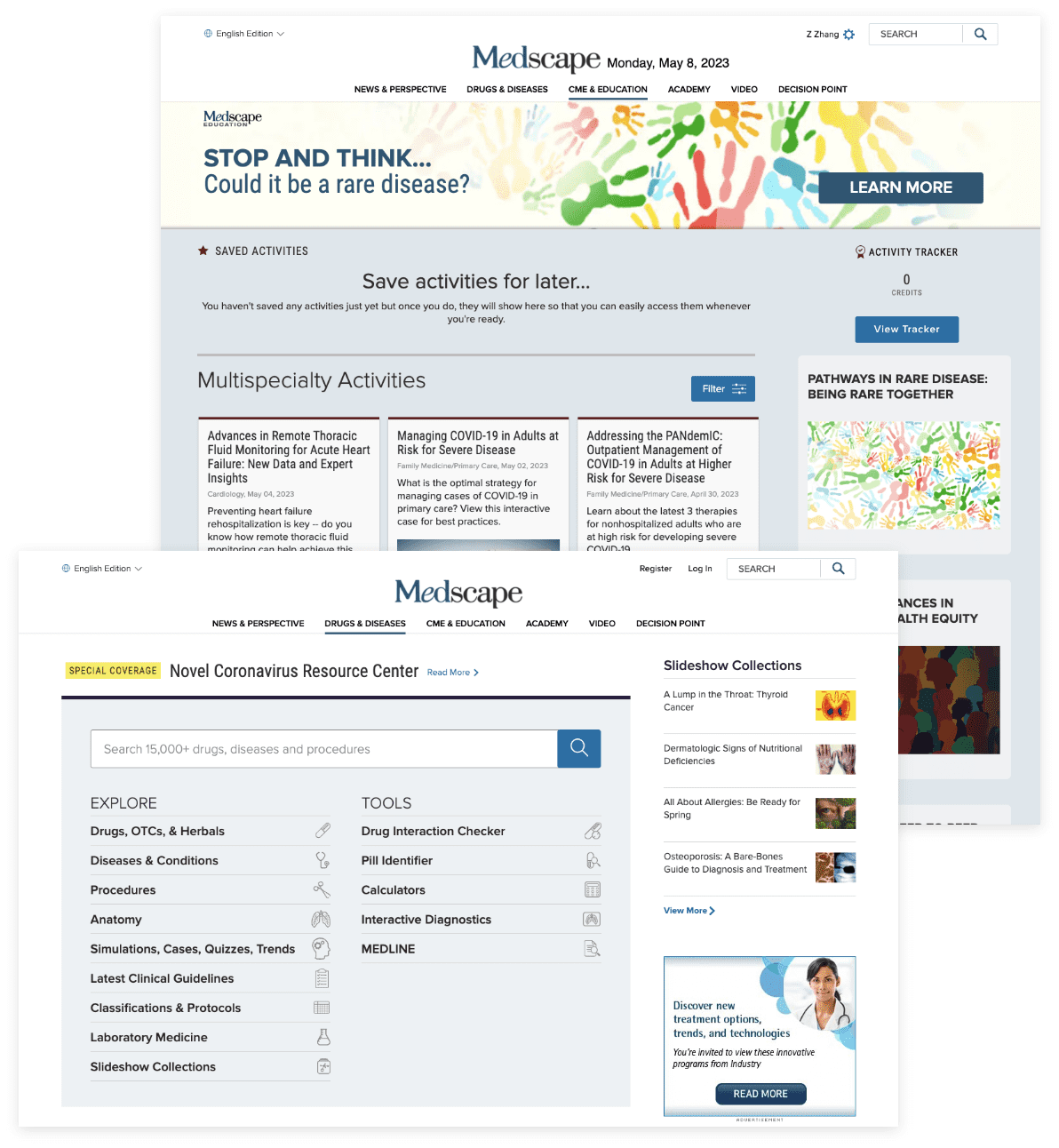
You are attending a medical conference next week and want to prepare by reviewing the latest news or research on a specific topic. Find recent articles or studies on “Immunotherapy in Cancer Treatment.”
You have a patient with a complex drug regimen, and you want to review potential drug interactions to ensure their safety. Search for potential interactions between “Warfarin” and “Aspirin.”
You are interested in finding a relevant CME activity for gaining credits, and you need to ensure that you are up to date with the most recent information in your field in the form of classes, articles, and other helpful content. Find a related CME activity that would help you meet the yearly credit requirements.


for Global Search
for Autocomplete Search
for Content Search
Gathering Insights
rainbow sheet
was utilized to synthesize our findings. Observations that were seen across three or more participants were prioritized as follows:
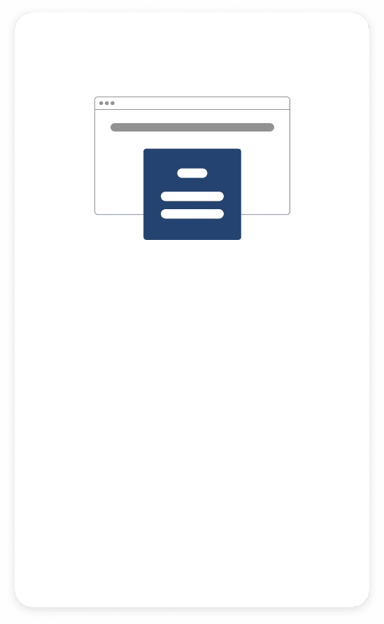


Even if users have already logged in to the site, the site will still prompt them to log in again after clicking the the needed information
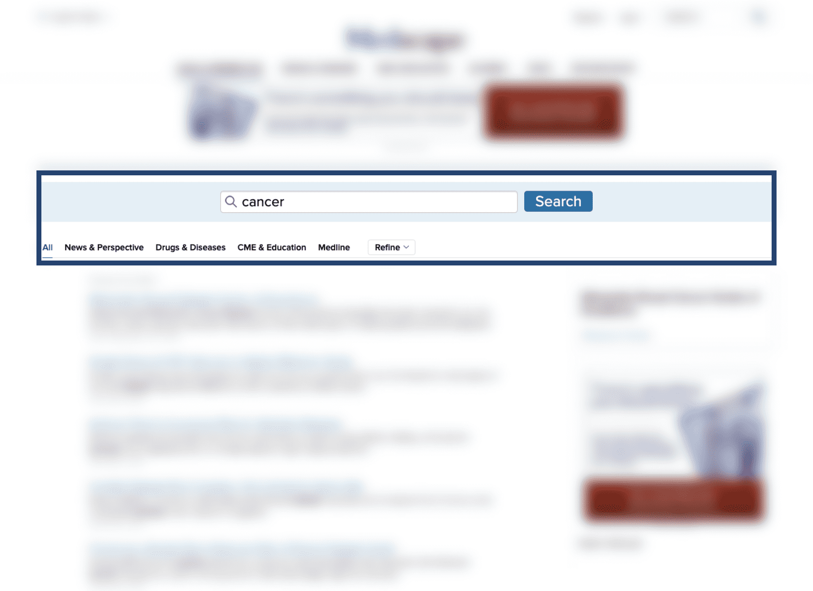
Difficulty searching for broad topics, such as cancer. Feels it would be easier to search for a specific health problems.
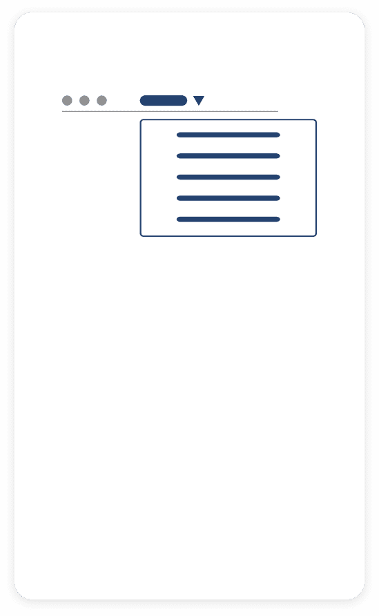
The way search results are listed is confusing. There is a filter, named “Refine”, many users can't find it.
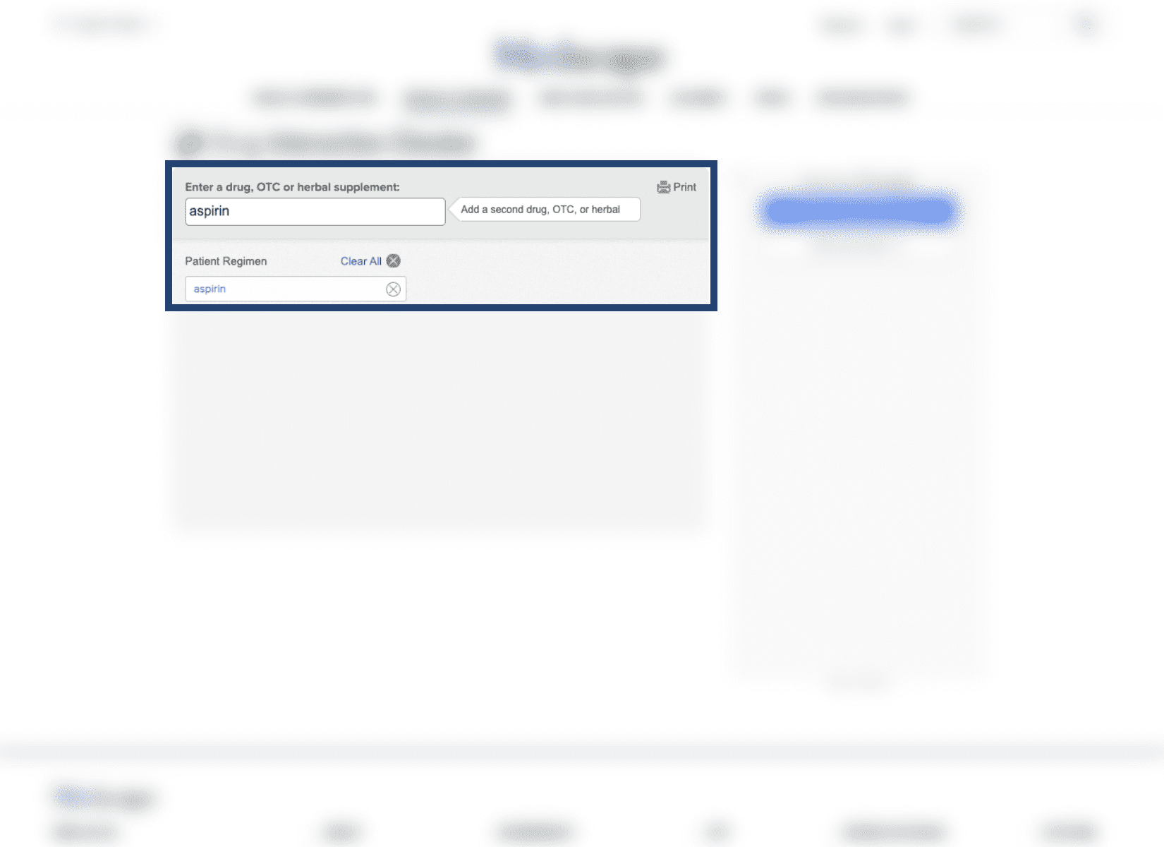
There is no place for users to add another drug at the Drugs Interaction Checker bar.
Too much content is above the fold on arrival to the CME page. Too congested and close-quartered.

Further Identification of Problems
three
of them. Also, as the site's desktop end presented more information, we decided toprioritize redesigning the desktop end and then the responsive design
.


specificity
search results page layout
mechanics of drug interaction search
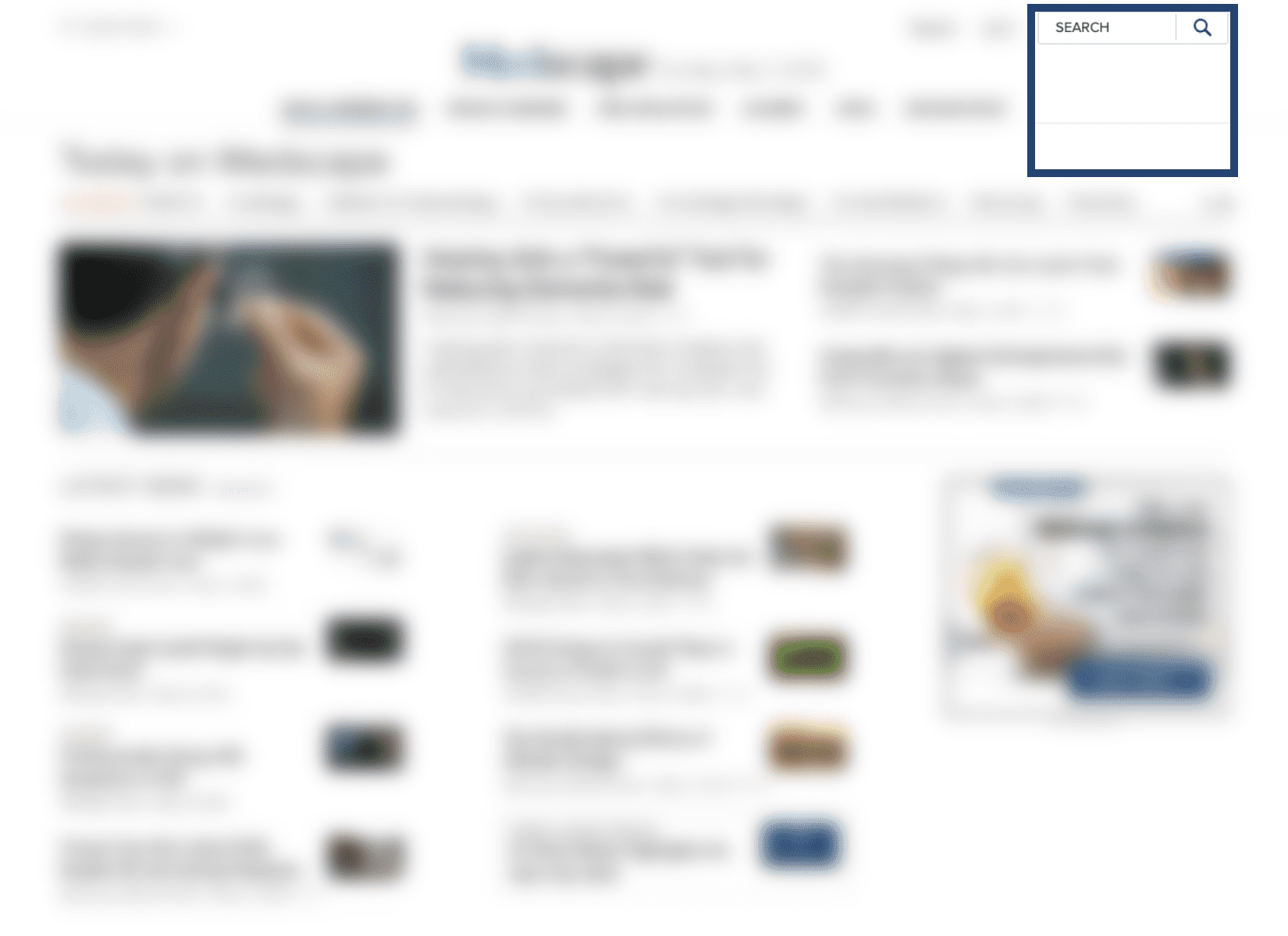
The global search with no specificity
The disorganized search results page layout
The confusing mechanics of drug interaction search
Rather than entering a search, going to the search results page, evaluating results, and then applying filters as necessary, several of our participants had filters in mind for their searches from the beginning.
While our participants were able to narrow down their search results to find their desired information, some participants hoped for a more intuitive filter function and streamlined design on the page.
Our participants expressed some frustration with the search inputs on the page and were confused by the mechanics of the search that required the user to delete the first input prior to inputting the subsequent inputs.


Goal 01 | Get Global Search More Specific
Goal 02 | Make Search Results Page More Organized
Goal 03 | Clarify Drug Interaction Search Mechanics
Incorporating Existing Filters
Streamlining Filtering Options
Intuitive Language & Signals
More Specific, More Discoverable. Better Organization.
An expandable filter option are created to allow users to immediately narrow down their search. The subcategories take the current search result page as the reference.
Remove duplicate titles from the search results page and include them in the filtering options instead, as most are already represented within the existing filters. Move the filter options so that they are immediately visible to users, with their individual options available in a drop-down menu.
Once a drug has been entered in the drug interaction checker, the content will be automatically deleted so that users can enter additional or any subsequent drugs. Also the text about adding additional drugs gets moved to the text box with the "Add" button to make the operation more intuitive.
3 solutions were recommended
View Mobile Version
View Mobile Version
View Mobile Version
View Desktop Version
View Desktop Version
View Desktop Version

Positive Feedback
our recommendations were well-received


The team found it really interesting, and is excited to use your report and recommendations as a jumping off point for our work on improving the search experience across the site.
The team experience was great! What impressed me the most was the final presentation, where we presented not only to the UX Leader, but also to the Director of Development, the Director Product Management, and the Product Manager. During the Q&A session, I learned about the different views of professionals with different backgrounds on the same issue. It was very beneficial and interesting for me.
my takeaways